RAY OF HOPE • NON-PROFIT ORGANISATION (PRO-BONO CLIENT)
Goodbye Spreadsheets, Hello Seamless Events
My primary role in this pro-bono project for the client, Ray of Hope, was User Research and User Interface Design. We designed a backend system targeted at charities to help them organise and manage key aspects of their fundraising events seamlessly.
Main features include event creation page, database of event registrations and donations and more to allow an all-in-one platform for all stages of event planning.
Primary Role
UX Research
Timeframe
October 2023
Team
BZ
SK
SO
Industry
Social Sector

Context
Designing an all-in-one backend system for charities, enabling them to create event pages, track registrations, manage donations, and streamline event planning. This would empower charities with essential tools to organise and oversee their fundraising efforts efficiently.
Problem
The current event management process for charities in Singapore is often fragmented and inefficient, relying on disconnected tools like Google Forms and Sheets. This creates a disorganised workflow, making event tracking and logistics tedious and manual.

Some quotes highlighting the problems and needs of some of the charities we interviewed
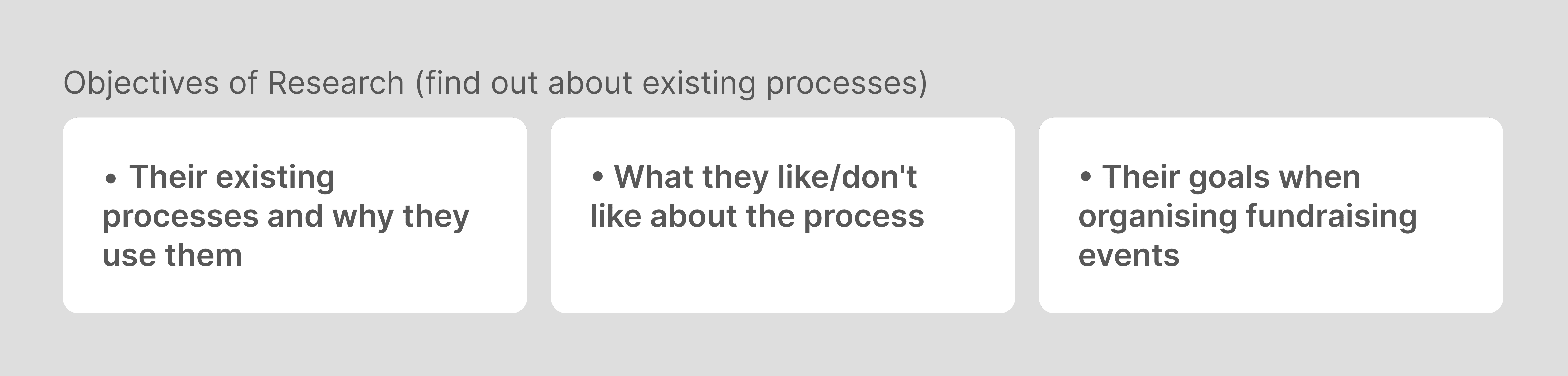
User Research Preparation
For user research, we first came up with the objectives of the interview. Then, we came up with the questions for the interview. A sample of the category of questions we asked our users are listed below.


Methodology - User Interviews
Initially, we set out to do User Interviews with employees in charity organisations that have organised charity events before. However, due to our short deadline and privacy concerns, the team struggled to recruit charity workers with fundraising experience
Methodology - Pivoting to Guerrilla Interviews
This prompted us to shift to Guerrilla Interviews which we conducted at a weekly food bank programme. We conducted on-site interviews with two volunteers and secured a follow-up with a charity founder. This experience sharpened our ability to prioritise key questions, adapt quickly, and handle real-time rejections, improving our recruiting and negotiation skills.

Left: A weekly food bank programme we went to to recruit interviewees (people who volunteered at charity organisations and have organised charity events before). Right: Conducting guerrilla interviews
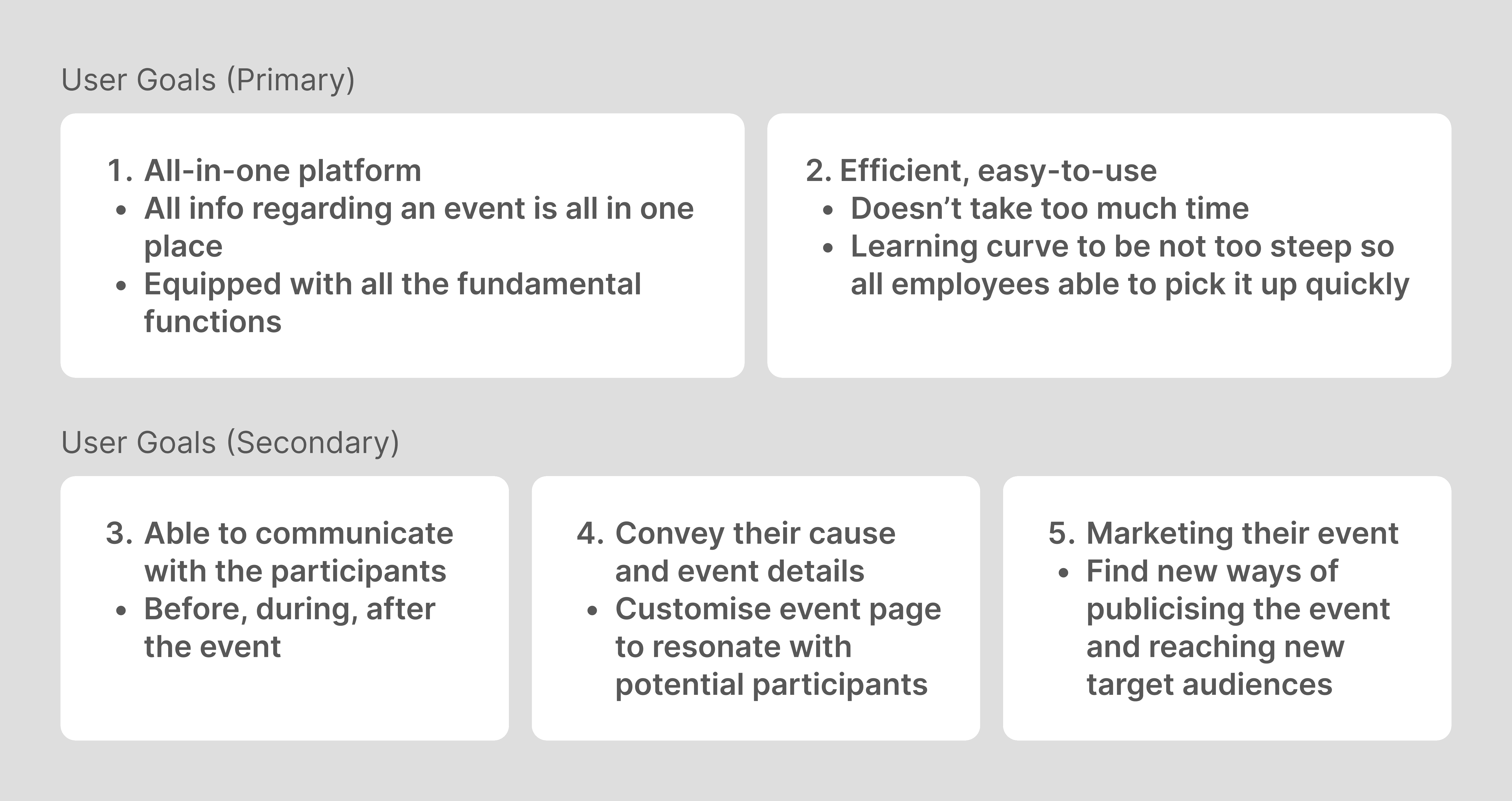
Insights
After Affinity Mapping, we distilled the primary insights (what users mentioned most). We also gathered insights that users mentioned relatively frequently and classified them as secondary user goals. For our Minimum Viable Product, our solutions would tackle our Primary User Goals. For further iterations, they would touch on the secondary goals.
Feature Prioritisation
Based on our contextual research through User Interviews and Competitive Analysis*, we came up with the features we wanted to include in our platform. Given that this was a 3-week sprint, we then prioritised them using the Moscow Analysis to determine which features were the most relevant for a Minimum Viable Product (MVP) to be presented to the Client so that the first prototype had the most essential functions that met both User and Business Goals.
*For Competitive Analysis, we analysed Gofundme (U.S. equivalent), Eventbrite (worldwide), Raisely (U.K., Australian equivalent)

Feature Prioritisation
Final Design: Tutorial for First-Time Users
To reduce the learning curve, when new users first sign up on the platform, they are immediately directed to a quick tutorial which runs through the process of a main function — Creation of a New Event
Tutorial for First-Time Users
Final Design: Event Creation (main function)
Users mentioned the desire to have a customisable event page to add event details, charity's branding and cause. Through sharing more about the charity and its beneficiaries, they hope to emotionally connect with potential donors and encourage more sign-ups.
Event Creation page: Customisable
Final Design: Event Creation (other functions)
Other than customising the event page, tickets etc, charities are also able to preview event before publishing. After publishing, they are able to share to different platforms to publicise event.
Preview Event, Publish Event, Share Event
Final Design: Event Tracking (Dashboard)
All updates are presented on the main dashboard with the most important information (according to our user interviews, the most important are: target donations and event sign-ups) arranged right at the top.
Event Tracking through updates on the Dashboard
Final Design: Event Communications
Users are able to filter all sign-ups according to common filters. In this case, the user is filtering according to medical condition in order to send a reminder to these users for the upcoming walkathon.
Event Communications through filtering inventory and filling in an email template
Outcomes
This was my first project with a real-life Client and it was very meaningful as we were working with a Non-Profit Organisation. We were very heartened and encouraged by the comments we received.

Some of the positive feedback we got from the charities that we tested our MVP with

Currently open to new opportunities. Say hi!
anjelicaong23@gmail.com
Resume
© Copyright 2025

Currently open to new opportunities
anjelicaong23@gmail.com
Resume
© Copyright 2025
Currently open to new opportunities
anjelicaong23@gmail.com
Resume
© Copyright 2025
RAY OF HOPE • NON-PROFIT ORGANISATION (PRO-BONO CLIENT)
Goodbye Spreadsheets, Hello Seamless Events
My primary role in this pro-bono project for the client, Ray of Hope, was User Research and User Interface Design. We designed a backend system targeted at charities to help them organise and manage key aspects of their fundraising events seamlessly.
Main features include event creation page, database of event registrations and donations and more to allow an all-in-one platform for all stages of event planning.
Team
BZ
SK
SO
Industry
Social Sector
Primary Role
UX Research
Timeframe
October 2023
Context
Designing an all-in-one backend system for charities, enabling them to create event pages, track registrations, manage donations, and streamline event planning. This would empower charities with essential tools to organise and oversee their fundraising efforts efficiently.
Problem
The current event management process for charities in Singapore is often fragmented and inefficient, relying on disconnected tools like Google Forms and Sheets. This creates a disorganised workflow, making event tracking and logistics tedious and manual.
Methodology - User Interviews
Initially, we set out to do User Interviews with employees in charity organisations that have organised charity events before. However, due to our short deadline and privacy concerns, the team struggled to recruit charity workers with fundraising experience
Methodology - Pivoting to Guerrilla Interviews
This prompted us to shift to Guerrilla Interviews which we conducted at a weekly food bank programme. We conducted on-site interviews with two volunteers and secured a follow-up with a charity founder. This experience sharpened our ability to prioritise key questions, adapt quickly, and handle real-time rejections, improving our recruiting and negotiation skills.
Left: A weekly food bank programme we went to to recruit interviewees (people who volunteered at charity organisations and have organised charity events before). Right: Conducting guerrilla interviews
Final Design: Event Creation (main function)
Users mentioned the desire to have a customisable event page to add event details, charity's branding and cause. Through sharing more about the charity and its beneficiaries, they hope to emotionally connect with potential donors and encourage more sign-ups.
Part of the Design System in dark and light mode — Modal (top); Button (bottom)
Final Design: Event Creation (other functions)
Other than customising the event page, tickets etc, charities are also able to preview event before publishing. After publishing, they are able to share to different platforms to publicise event.
Preview Event, Publish Event, Share Event
Final Design: Event Tracking (Dashboard)
All updates are presented on the main dashboard with the most important information (according to our user interviews, the most important are: target donations and event sign-ups) arranged right at the top.
Event Tracking through updates on the Dashboard
Final Design: Event Communications
Users are able to filter all sign-ups according to common filters. In this case, the user is filtering according to medical condition in order to send a reminder to these users for the upcoming walkathon.
Event Communications through filtering inventory and filling in an email template
Outcomes
This was my first project with a real-life Client and it was very meaningful as we were working with a Non-Profit Organisation. We were very heartened and encouraged by the comments we received.
Navigation bar: Example here shown on desktop size and mobile size
Some quotes highlighting the problems and needs of some of the charities we interviewed
Methodology - User Interviews
For user research, we first came up with the objectives of the interview. Then, we came up with the questions for the interview. A sample of the category of questions we asked our users are listed below.
Insights
After Affinity Mapping, we distilled the primary insights (what users mentioned most). We also gathered insights that users mentioned relatively frequently and classified them as secondary user goals. For our Minimum Viable Product, our solutions would tackle our Primary User Goals. For further iterations, they would touch on the secondary goals.
Feature Prioritisation
Based on our contextual research through User Interviews and Competitive Analysis*, we came up with the features we wanted to include in our platform. Given that this was a 3-week sprint, we then prioritised them using the Moscow Analysis to determine which features were the most relevant for a Minimum Viable Product (MVP) to be presented to the Client so that the first prototype had the most essential functions that met both User and Business Goals.
*For Competitive Analysis, we analysed Gofundme (U.S. equivalent), Eventbrite (worldwide), Raisely (U.K., Australian equivalent)
Feature Prioritisation
Final Design: Tutorial for First-Time Users
To reduce the learning curve, when new users first sign up on the platform, they are immediately directed to a quick tutorial which runs through the process of a main function — Creation of a New Event
Tutorial for First-Time Users